The 2025 Senior Art Exhibition was officially opened by distinguished Korovian and three-time Archibald Prize finalist Jaq Grantford (Corben, Class of 1984). On opening night, a number of awards were presented to recognise outstanding student work across a range of disciplines.
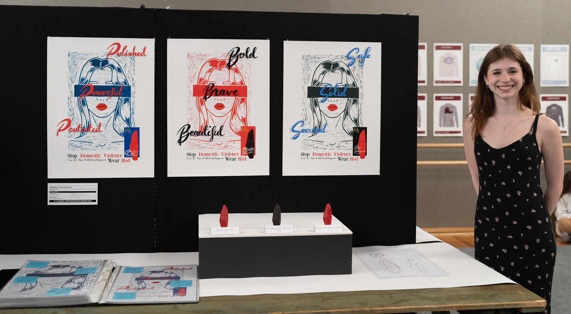
The recipient of the Jan Miller Design Acquisition Award was Year 12 student Sari Adamson for her powerful Visual Communication Design project, featuring a lipstick and poster campaign that raises awareness of domestic violence. Donated by the Korovian Club, the award ensures Sari's work is professionally framed and displayed within the School, where it can continue to spark conversation and reflection among students, staff, and visitors.
We caught up with Sari following her graduation to reflect on the creative process behind this thought-provoking body of work.
What first sparked the idea for this body of work?
I knew I wanted to do something that related to makeup. I'd always loved the self-expression it allowed its users to create, and the idea of becoming a more confident version of oneself through a product is such an intriguing concept.
Along with that, I knew that I didn't just want to create an item, but a message. Makeup is known to conceal, but I wanted to flip that idea on its head. Why not use something meant to cover up to draw attention to, and call out, an issue?
Many forms of media, and real life, use makeup to conceal bruises, marks, or abrasions resulting from issues such as domestic violence. To call this out, I knew I wanted to go against the expectations of what makeup is typically used for.
How did you choose the words featured on your posters and what do they represent to you?
The words are all unified, as they relate to strength, power, and the character needed to come back from struggles. To me, they represent the qualities shown by the victims that my products support.
They are not just words, but a display of the individuals brought together through the meaning of my work and product.
Can you talk us through the blindfold motif and what it symbolises in the context of the work?
The idea of the character visualised in my artwork being blindfolded is an expression of what we, as a community, tend to be blind towards. Makeup can only do so much; at some point, people must admit that there is a level of blindness, whether intentional or not, that takes place for people not to notice the signs.
The blindfold is a symbol of the makeup that, if removed, could help them see their true power, which lies just beyond it. It stands not only as a visual emphasis for the text, but also as a symbolic gesture to show how they might feel alone in the dark when they live without the chance to see what they could be without the concealer.
Colour plays a strong role here, particularly red. What does colour communicate in your work beyond aesthetics?
I really wrestled with the hue of red that I should employ. In the end, it was primary red, the beginning hue that makes up each tone and shade we might count as being part of the red family.
Before I settled on that, I brainstormed many different shades of red and what they might symbolise. All shades of red have strong symbolic connections to the topic at hand, but with so many options, I chose to use the colour that is required to make each of these red tones and shades.
That's because domestic violence isn't just one thing, but everything and anything that leads to a victim becoming a victim. Primary red is present in all shades of red and, thus, is the perfect choice to symbolise the many different levels of understanding and knowledge surrounding the domestic violence community.
What materials or techniques challenged you the most during this project?
Well, I had only ever used lino cutting when I was very young, so I was basically a complete beginner going into it. And, being me, I chose to go big or go home.
My teacher had suggested using an A5 print that we could simply scale up, but because I love a challenge, I went ahead and began lino cutting an A3 sized print.
Knowing close to nothing about what I was taking on, I experienced a lot of trial and error. From using the wrong markers to nearly slicing my fingers, this was by far one of the hardest tasks I undertook for the project. With only three weeks to complete it, I hadn't given myself a whole lot of time or room for mistakes.
It tested my patience, steadiness, and motivation, but it was also the most rewarding challenge. Getting to see the print come to life after rolling the paint on and pressing it to the paper made it feel like I was meeting an old friend.
With lino printing, there really is no way of knowing how it will look until it is finished, and I couldn't be prouder of how it turned out.
How did feedback from teachers and other students help develop/shape the outcome?
Without my classmates or teachers, this project would not have ended up the way it did. My fellow students helped me keep the aesthetics and ideas on track, especially my best friend, who never held back from telling me when I could do better (she was always right).
My teachers helped me explore the ideas more deeply than I had before, leading me to new outcomes I hadn't even begun to think of. The feedback I received from my class had a major influence on keeping the heart and soul of the project at the forefront and ensuring the final outcome was exactly how I had imagined it.
How did your time at Korowa support you in taking creative risks with this project?
I moved to Korowa for Year 9 and have been here ever since. Before that, my previous school hadn't really encouraged me to experiment with artistic ventures, but once I arrived at Korowa, my world was flipped.
Years 11 and 12 were spent exploring mediums and creative opportunities that would never have been accessible to me otherwise. While working on this project, I was able to utilise and experiment with all types of physical creations, including 3D printing, sculpture, papier mâché, and much more.
The seemingly endless range of creative avenues I could explore simply because Korowa offered them meant that I didn't have to hold back when taking creative risks. The school gave me countless opportunities to see how this project could flourish, and the final outcome undoubtedly benefitted from that.
What skills from your Visual Communication Design studies are you taking into your next chapter?
I'd say the best skill I've gained from this class is the ability to take an idea and develop it further. Being able to take a seemingly finished idea and put it through a process like SCAMPER helps flesh out and strengthen it.
It's a skill that can make a run down project feel brand new and ready to be revisited. I learned how to take an idea and explore it until it becomes something entirely new, and that's something that is incredibly useful not just for design, but professionally and personally as well.
Since graduating from Korowa, Sari has spent her gap year in the United Kingdom through the Letz Live program. Working at a school in a small village, she has embraced the opportunity to gain valuable experience, immerse herself in a new culture, and continue developing the confidence and independence that shaped her creative journey.